KaizenLab — Brand Identity: A Brand Design Case Study
Brand Identity · Creative Studio · Co-founder · 2026
Role
Brand Designer / Co-founder
Type
Brand identity · Creative studio
Stage
2026
KaizenLab is a creative studio building branding and digital product experiences for SaaS startups. As co-founder and brand designer, I was responsible for creating the studio's own identity from scratch.
The challenge was building something credible enough to work with technology companies without becoming another restrained, overly polished SaaS brand. We needed personality without sacrificing professionalism.
Rather than treating strategy, identity, illustration and motion as separate workstreams, I developed everything around one visual concept that could generate an entire system: playing blocks.
My role
Brand Designer / Co-founder
- Brand Strategy
- Creative Direction
- Logo Design
- Visual Identity
- Typography
- Colour System
- Character Design
- Illustration System
- Motion Direction
- Brand Applications
Team
2-person founding team
The challenge
KaizenLab needed to feel credible enough to work with technology companies without becoming another restrained, overly polished SaaS brand.
The challenge was finding the balance between professionalism and personality. We wanted something playful, funny and human, while still feeling intentional and capable of supporting serious product and brand work.
Brand direction
The name Kaizen comes from the idea of continuous improvement. Instead of interpreting this through symbols of growth, progress or technology, I focused on the behaviour behind it:
Try → Learn → Adjust → Improve
That led to the idea of a lab: a place where things are tested, combined, taken apart and tried again. From there, traditional playing blocks became the central metaphor for the identity. They represent both building and experimentation.
Playing with blocks is an iterative process. You move something, rotate it, combine it with something else, realise it doesn't work, take it apart and try again. That behaviour reflects both Kaizen and the way we approach creative work.
Logo exploration
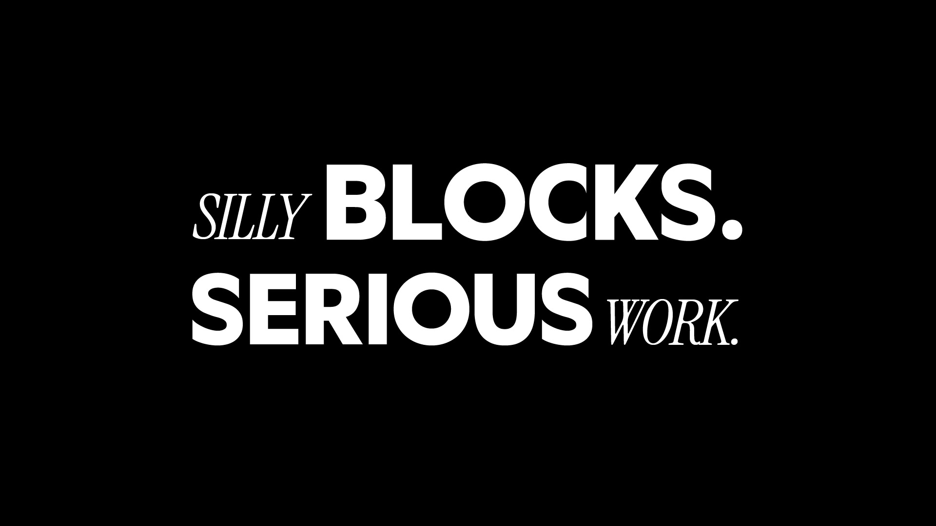
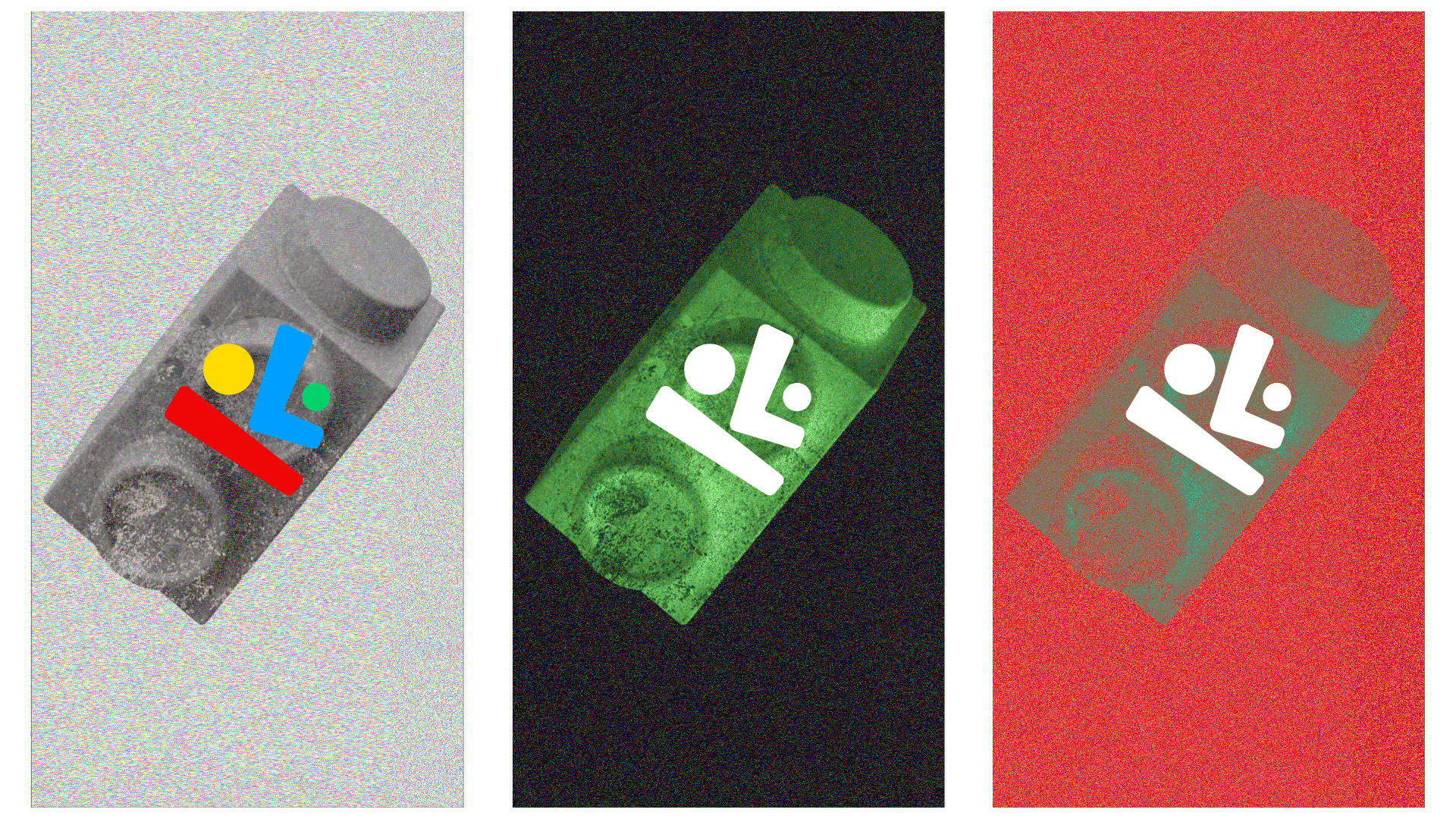
I reduced the idea of traditional playing blocks into a small set of simple geometric forms. The goal wasn't to illustrate toys literally. The forms needed to remain abstract enough to work as a contemporary identity while retaining the familiarity and playfulness of physical blocks.
Through different arrangements, rotations, scales and combinations, I explored how a limited set of shapes could create something recognisable.
Form & composition
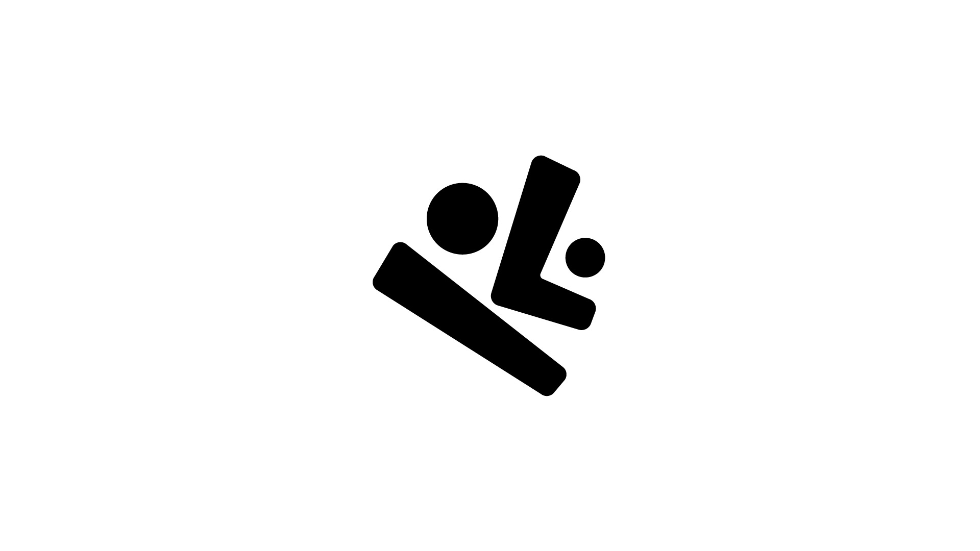
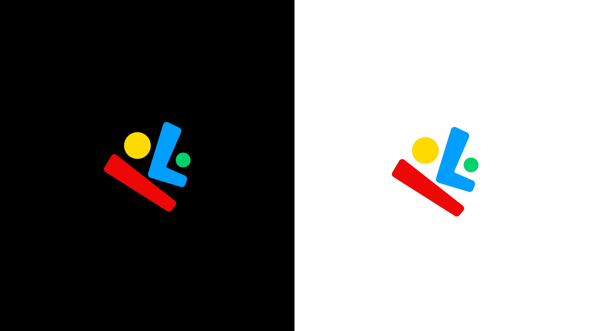
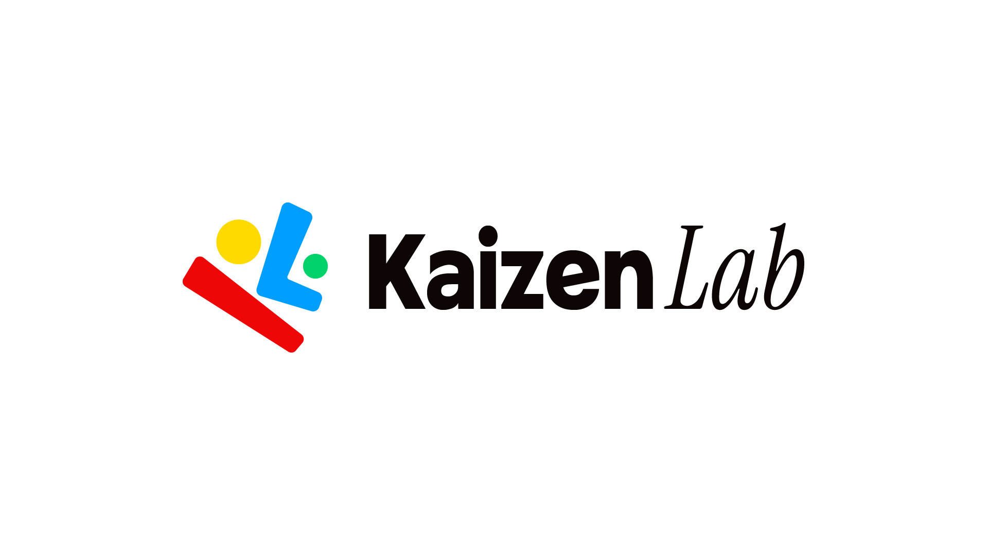
The final mark is constructed from four simple geometric pieces inspired by traditional building blocks, which also come together to suggest an abstract human face. The tilted forms and uneven placement give the face a distinct attitude: playful, cheeky and slightly careless rather than polished or overly friendly.
The composition is intentionally loose and asymmetric. Different scales, angles and irregular negative spaces create movement and spontaneity while allowing every piece to remain recognisable independently.
Careless in attitude. Considered in execution.
Colour
The identity uses four bold, high-saturation colours: yellow, blue, red and green. Instead of adopting the restrained palettes common across SaaS branding, I wanted the colour system to feel immediate, optimistic and unrestricted.
Each block owns a colour, making the individual forms recognisable even when removed from the complete logo. Black and white provide the foundation, allowing the four colours to remain the dominant visual signal.
Yellow
#F5C842
Blue
#3B6CF6
Red
#E63329
Green
#2DB562
Black
#111111
White
#FFFFFF
Typography
The wordmark combines Granse for "Kaizen" with Instrument Serif for "Lab". Granse gives Kaizen a bold, geometric and contemporary presence that connects with the simple geometry of the blocks.
Instrument Serif introduces contrast through a more human, expressive and editorial character. Together they represent two sides of the studio.
Structure meets expression.
Kaizen
Granse — Bold, geometric
Lab
Instrument Serif — Expressive, editorial
From logo to system
The four shapes were designed as a kit of parts. They can separate, rotate, scale, repeat and recombine to create new compositions while remaining recognisably KaizenLab. This allowed the logo itself to generate the wider visual language rather than introducing unrelated decorative assets.
One mark. Four pieces. Many combinations.
Turning the logo into characters
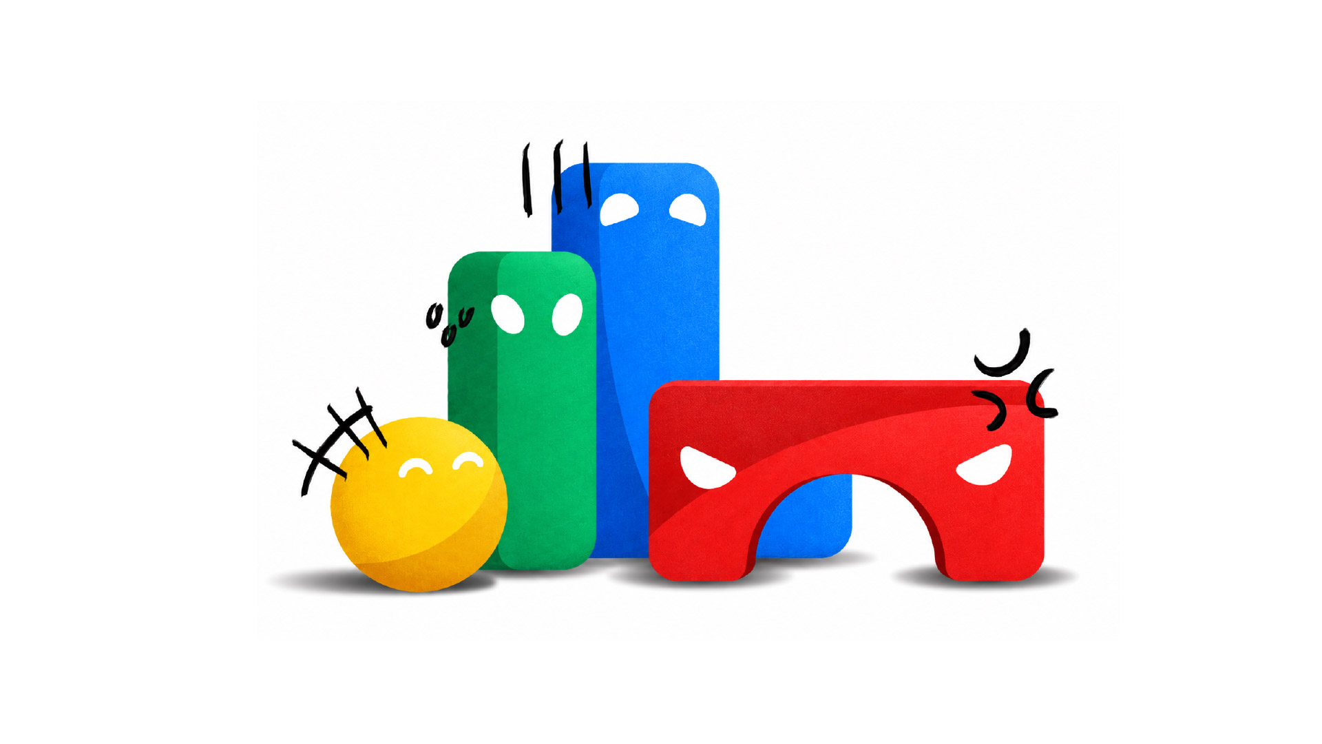
Rather than designing a separate mascot, I developed the existing logo pieces into characters. This keeps the character system directly connected to the identity. The same shape can exist as a logo element, graphic asset or character depending on the context.
I explored different levels of characterisation, including completely abstract blocks, limbs, props and facial features. Adding too much made the system feel like a conventional children's mascot. Adding nothing limited its ability to communicate emotion.
The solution was to keep the original geometry intact and introduce one human feature:
the eyes.
Expression through eyes
The characters use white eyes without mouths or detailed facial features. Changes in eye shape, angle, spacing and direction can communicate curiosity, frustration, excitement, confusion, suspicion or humour without changing the underlying block.
Illustration system
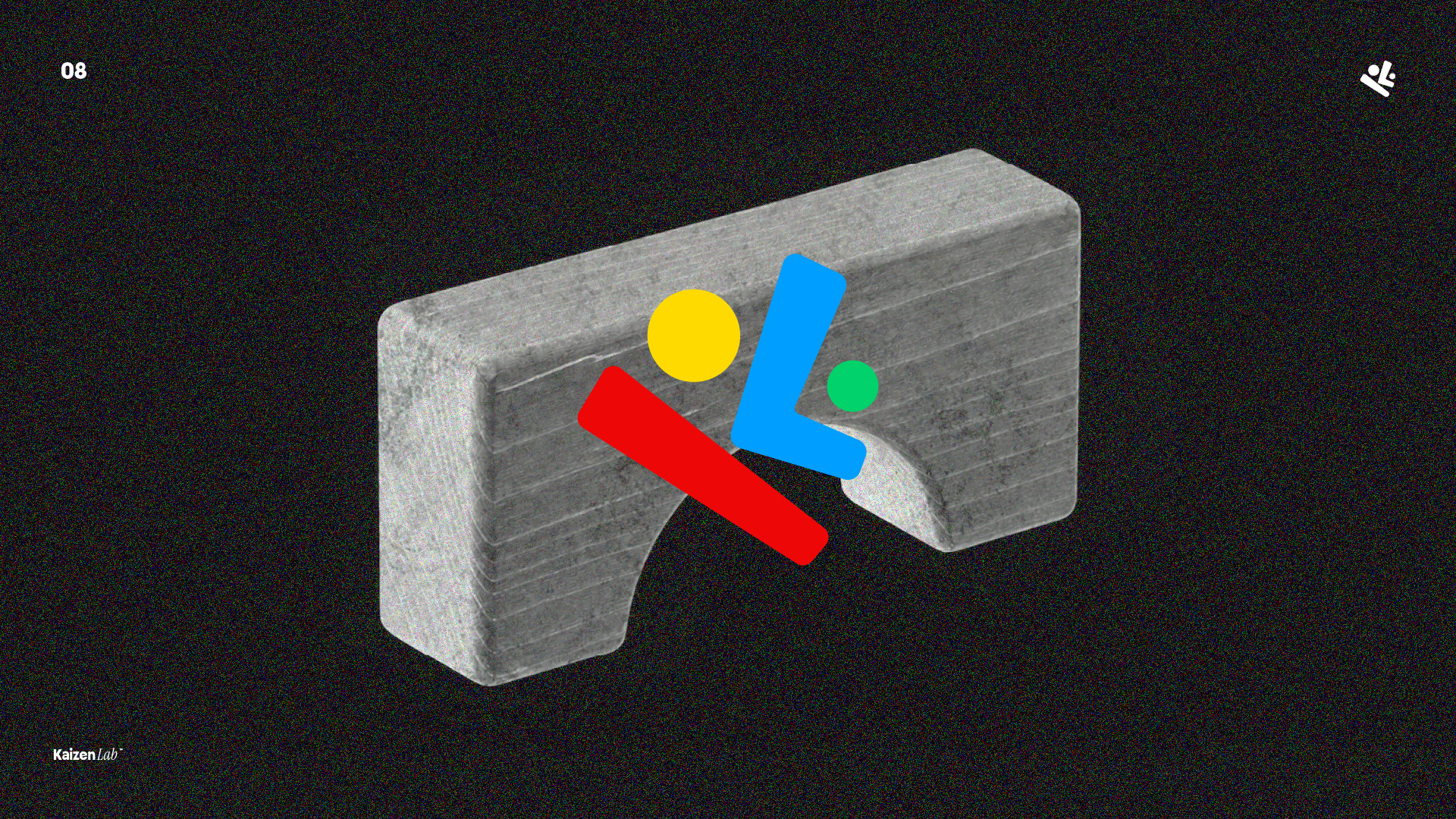
The illustration style builds on the simplicity of the original logo while giving the blocks more physical presence. Clean silhouettes preserve the geometry of each character, while controlled shading and grain introduce depth and texture.
The result sits between a flat brand graphic and a physical object, allowing the characters to feel alive without becoming overly cartoon-like.
Designing for expansion
The identity was designed as a system rather than a collection of individual assets. Logo shapes become graphic elements. Graphic elements become characters. Characters become illustrations. The same visual language extends across digital products, websites, social content, presentations and future motion work.
01
Logo shapes
02
Graphic elements
03
Characters
04
Illustrations
Applications
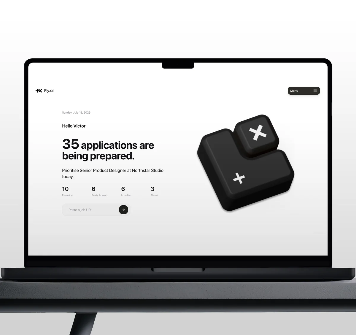
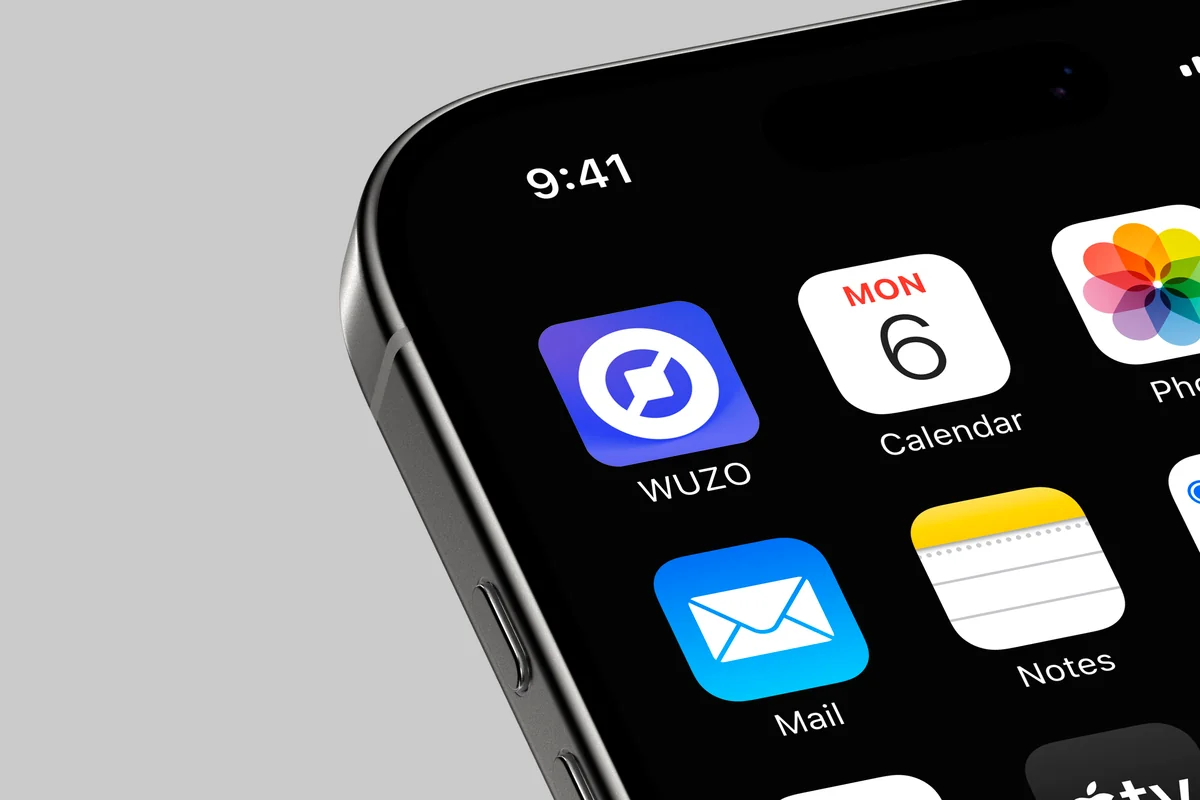
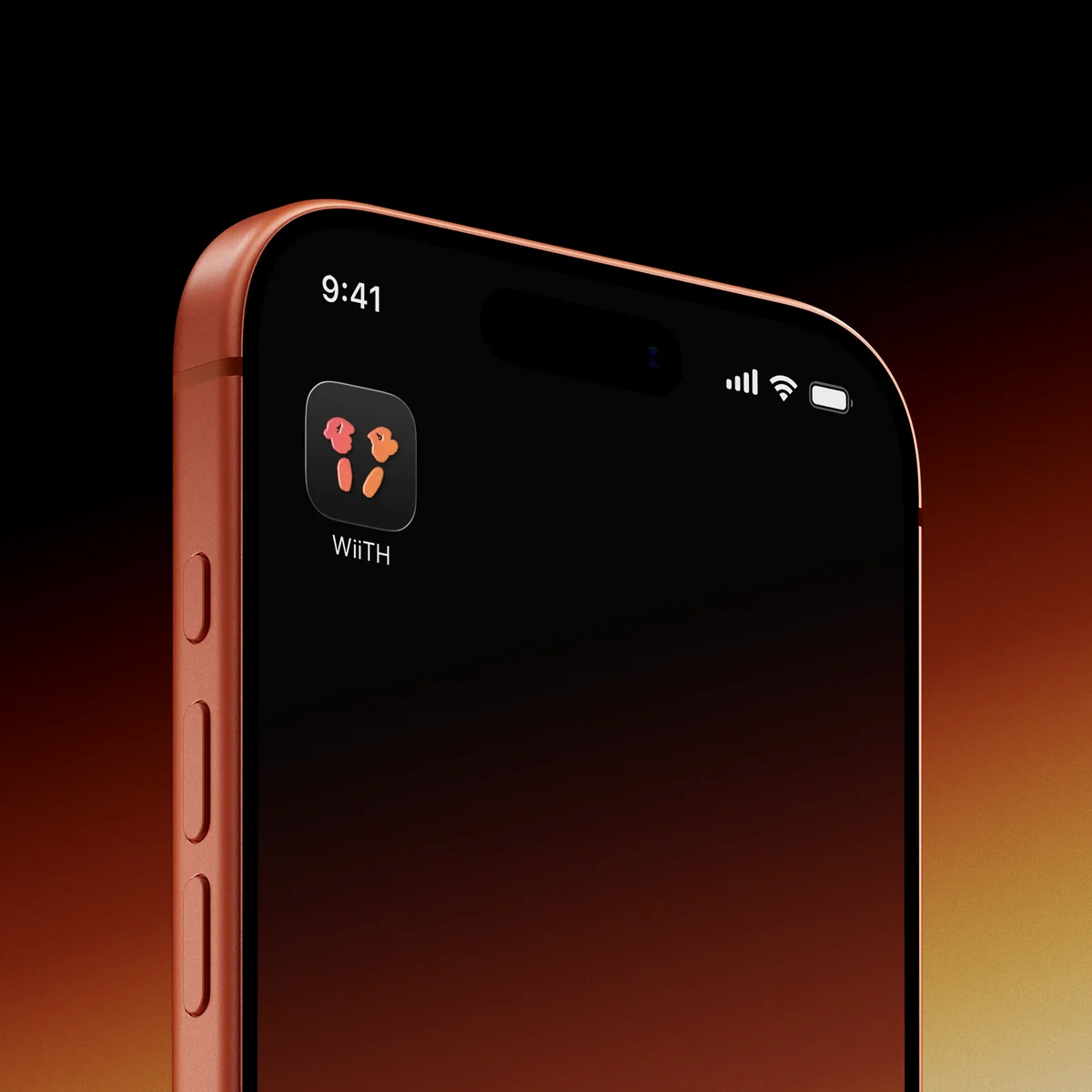
The system was tested across different contexts to understand how much or how little of the identity was needed for the brand to remain recognisable. Rather than repeating the complete logo everywhere, applications can use individual blocks, colour, typography or characters depending on the communication.
Outcome
KaizenLab developed from a logo into a flexible visual world built around one consistent idea. The final system connects the meaning of Kaizen with the behaviour of experimentation: things can be moved, separated, tested and rebuilt without losing their identity.
More importantly, it gave the studio a way to communicate technology differently: with more personality, humour and humanity.
Morework
Ply.ai
AI Product Design