Mou — Brand Identity: An AI Agent Brand Design Case Study
Brand Identity · AI Agent · SaaS · 2026
An intelligent engine for getting things done.
Role
Brand Designer
Type
AI agent · Brand identity
Stage
2026
Mou is an AI agent designed to turn intention into action. Rather than simply answering questions, it understands what needs to happen, coordinates the moving parts and helps move tasks forward.
I developed Mou's visual identity from the ground up, spanning creative direction, logo design, colour, typography, character direction and motion principles.
My role
Brand Designer
- Brand Strategy
- Creative Direction
- Visual Identity
- Logo Design
- Character Design
- Motion Direction
- Brand System
Client
Mou
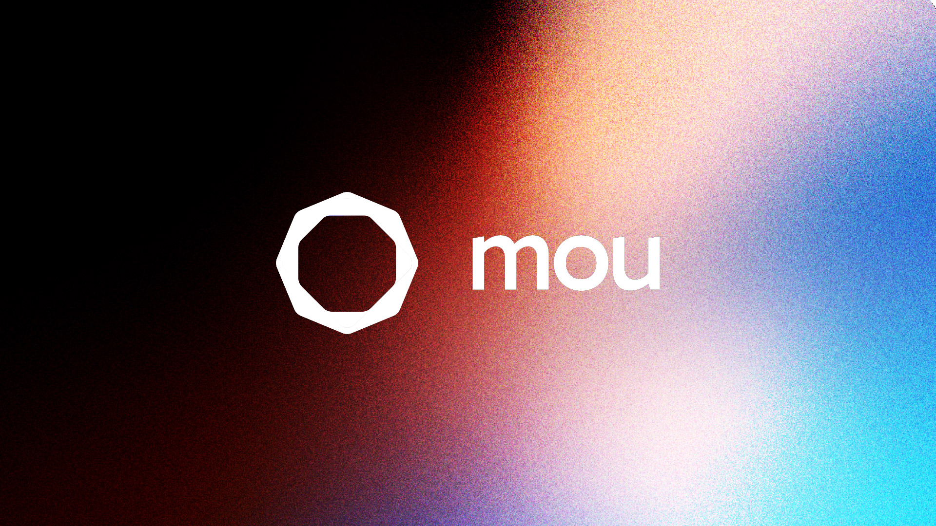
One continuous ribbon
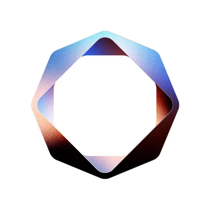
The Mou mark is constructed from a single continuous strip folded around an octagonal path.
Each section leads into the next, creating a closed system with no obvious beginning or end. The structure reflects the way Mou works behind the scenes: receiving an intention, coordinating what needs to happen and continuously moving it towards action.
The underlying octagonal geometry gives the mark precision and structure, while the folds introduce movement and transformation.
Four colours, one environment
The identity is built from four core colours: red, warm cream, blue and near-black.
Individually, they provide a simple and flexible foundation for the wider brand system. Together, they blend into Mou's primary gradient, creating a more atmospheric and expressive visual language.
Rather than behaving like a conventional linear brand gradient, the colours bleed into one another with shifting areas of light, darkness and saturation.
Red
#C80000
Cream
#FAE0C3
Blue
#4B7FCA
Near-black
#0C0003
A system in motion
Mou's primary graphic environment is created by blending the four core colours into a continuous field.
Deep black and red build density and contrast, while blue and warm cream introduce light and openness. Where the colours meet, new tones of violet, pink, cyan and warm red emerge naturally.
This creates a visual system that feels less like a fixed background and more like an active environment.
The gradient can shift in composition, scale and intensity across different applications while always originating from the same four-colour palette.
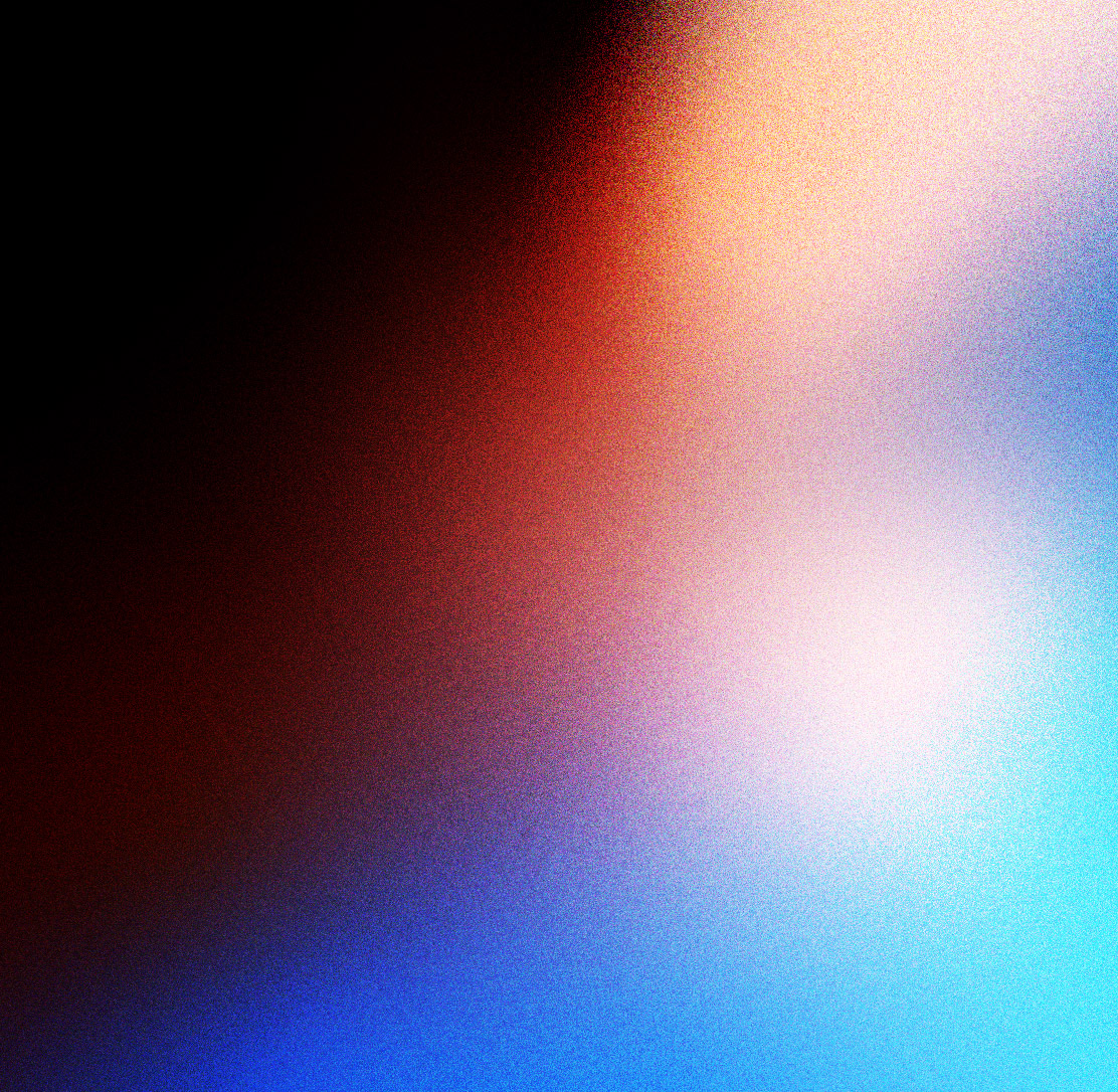
Adding depth through grain
A layer of grain is introduced across the gradient to prevent the colour transitions from feeling overly digital or synthetic.
The texture softens the boundaries between colours and gives large areas of colour more depth, while maintaining the clarity of the underlying palette.
This contrast between precise geometry and textured colour became an important part of the identity:
Structured form. Atmospheric environment.
Logo and colour
The mark can move between two primary behaviours.
In expressive brand moments, the four-colour gradient lives directly inside the folded structure, allowing different sections of the mark to move between light, colour and near-black.
In functional applications, the mark reduces to a single flat colour, allowing it to remain clear at smaller sizes and against more complex backgrounds.
This gives the identity both an expressive and functional mode without requiring different versions of the underlying symbol.
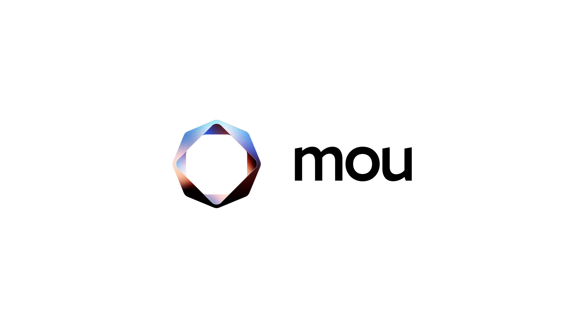
Visual system
The wider identity is built around the contrast between a controlled graphic structure and a more fluid colour environment.
The logo remains precise and recognisable while the gradient is allowed to shift, crop and change intensity around it.
This creates a simple system with two distinct behaviours:
The mark provides structure.
Colour provides movement.
Together they allow Mou to feel intelligent and technological without relying on conventional AI visual cues.
Outcome
Mou developed from an abstract idea of an AI assistant into a brand built around a clearer role: an intelligent operator that understands intention and helps turn it into action.
The resulting system deliberately separates precision from personality. The continuous folded mark represents the intelligence and coordination behind the product, while the character provides a more human surface for interaction. Together, they give Mou room to feel capable and premium when trust matters, while remaining expressive and memorable when personality matters.
Reflection
The project reinforced the importance of separating what a brand does from what its category normally looks like. Early exploration could easily have resulted in a recognisable "AI identity", but focusing instead on Mou's behaviour led to a more useful question.
That shift influenced everything from the continuous logo structure to the decision to separate the system identity from the character.
Morework
Ply.ai
AI Product Design