PHYASE // — Brand Identity System: A Brand Design Case Study
Brand Identity · Hong Kong · Physio & Sport Performance · Delivered
Role
Brand Designer
Type
Brand identity · Sport performance
Stage
Delivered
PHYASE // is a Hong Kong-based physio and sport performance brand built around a singular belief: returning from injury or pause isn't about going back to where you were — it's about redefining what's possible.
I was brought in as Brand Designer from the ground up — responsible for everything from naming strategy, brand concept, and tagline development to the full visual identity system, including logo construction, typography, colour, and photography direction.
Working directly with the founder, every design decision was anchored in the brand's core philosophy: movement, momentum, and the second phase of performance. A key client requirement was that the branding guideline be usable for future solo purposes — so the design system had to be minimal, easy to replicate, yet carry a strong professional and modern presence.
My role
Brand Designer
- Brand naming & concept strategy
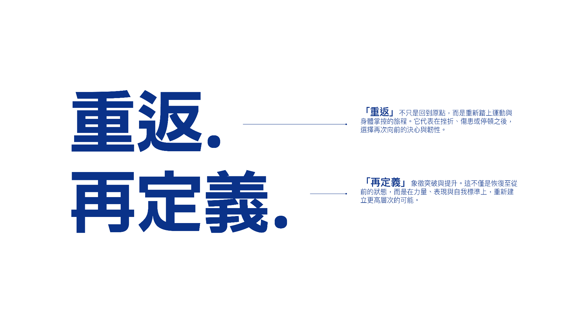
- Tagline development (EN & Traditional Chinese)
- Logo design & system construction
- Colour palette & typography
- Photography art direction
- Brand guidelines delivery
Collaborators
- Founder (Client)
Naming & Brand Concept
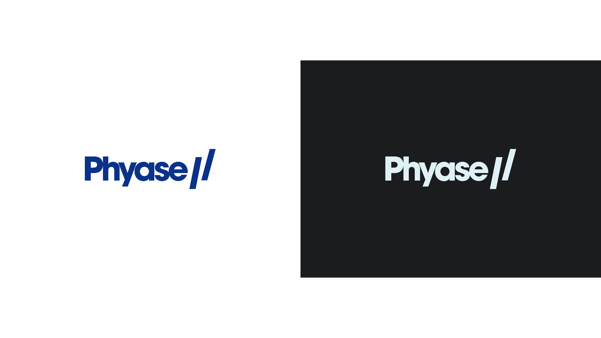
The name PHYASE is a deliberate fusion — physio meets phase. It signals both the clinical precision of physiotherapy and the forward momentum of entering a new phase of performance.
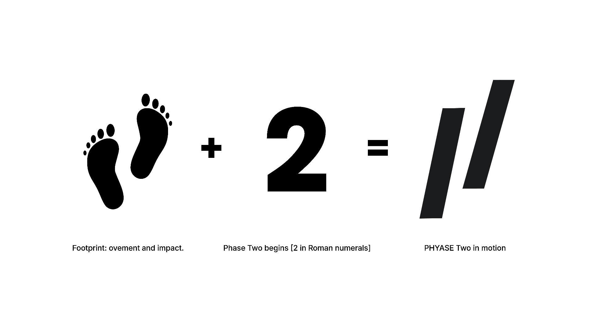
The // logomark completes the story. Derived from Roman numeral II — representing Phase Two — the double-slash embodies movement and impact, like footsteps propelling forward. This symbol became the brand's most distinctive visual asset.
Logo System
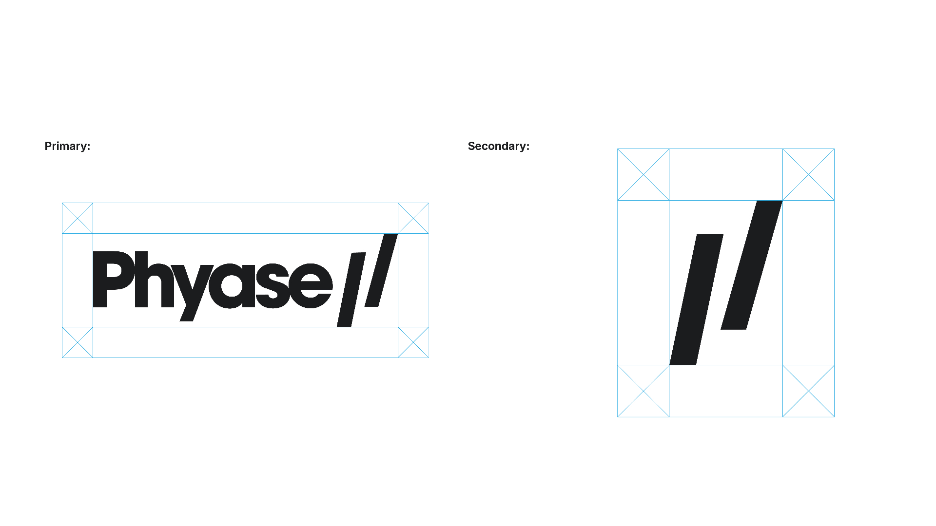
The logo system was designed for versatility across digital, print, and physical applications. Two distinct variants were created — a horizontal primary lockup and a standalone mark — allowing the brand to flex across different contexts without losing coherence.
Construction & Anatomy
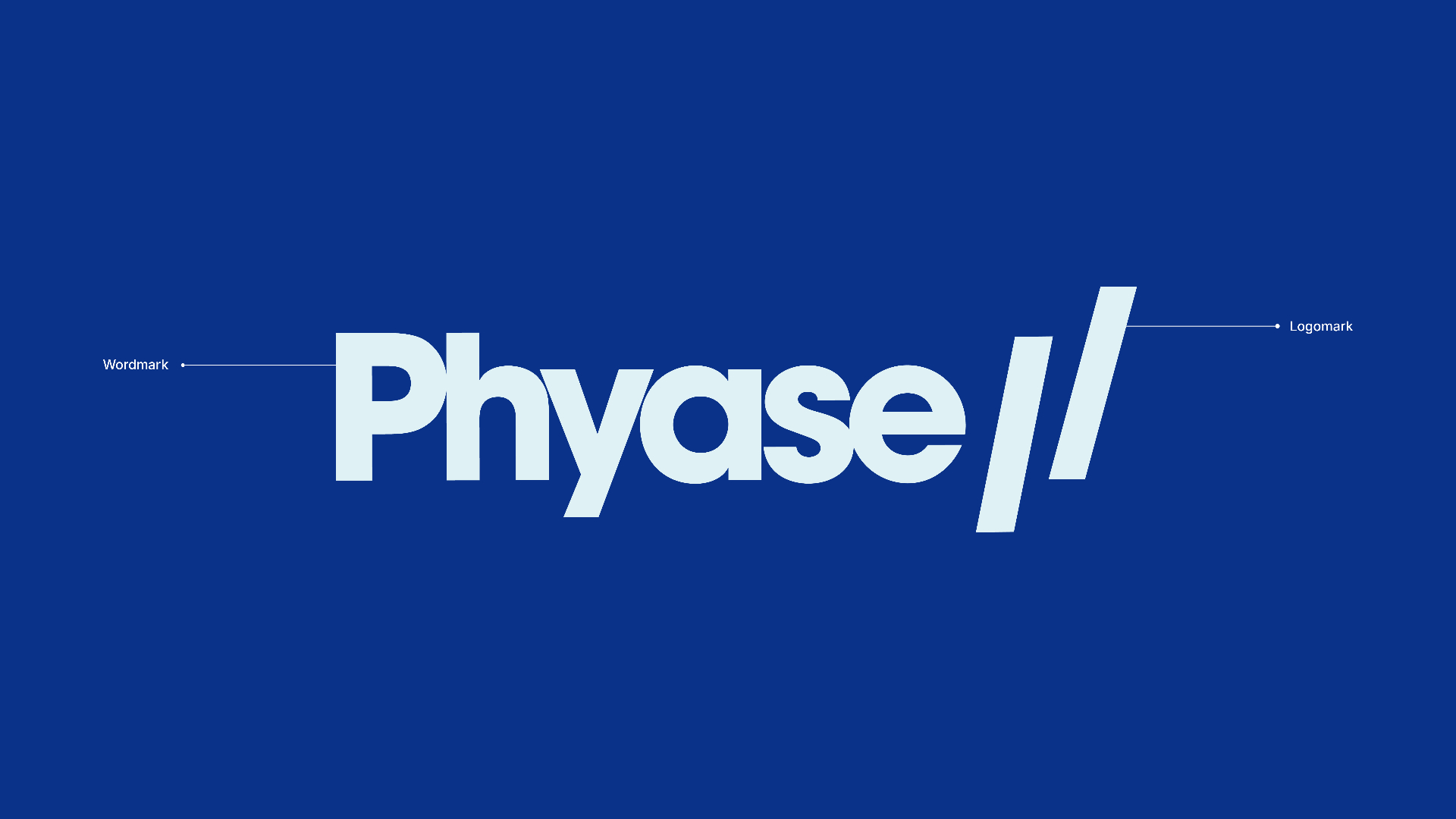
The wordmark uses a bold, condensed sans-serif that conveys strength and forward motion. The // logomark is constructed at a deliberate angle — echoing dynamic movement while maintaining geometric precision.
Tagline
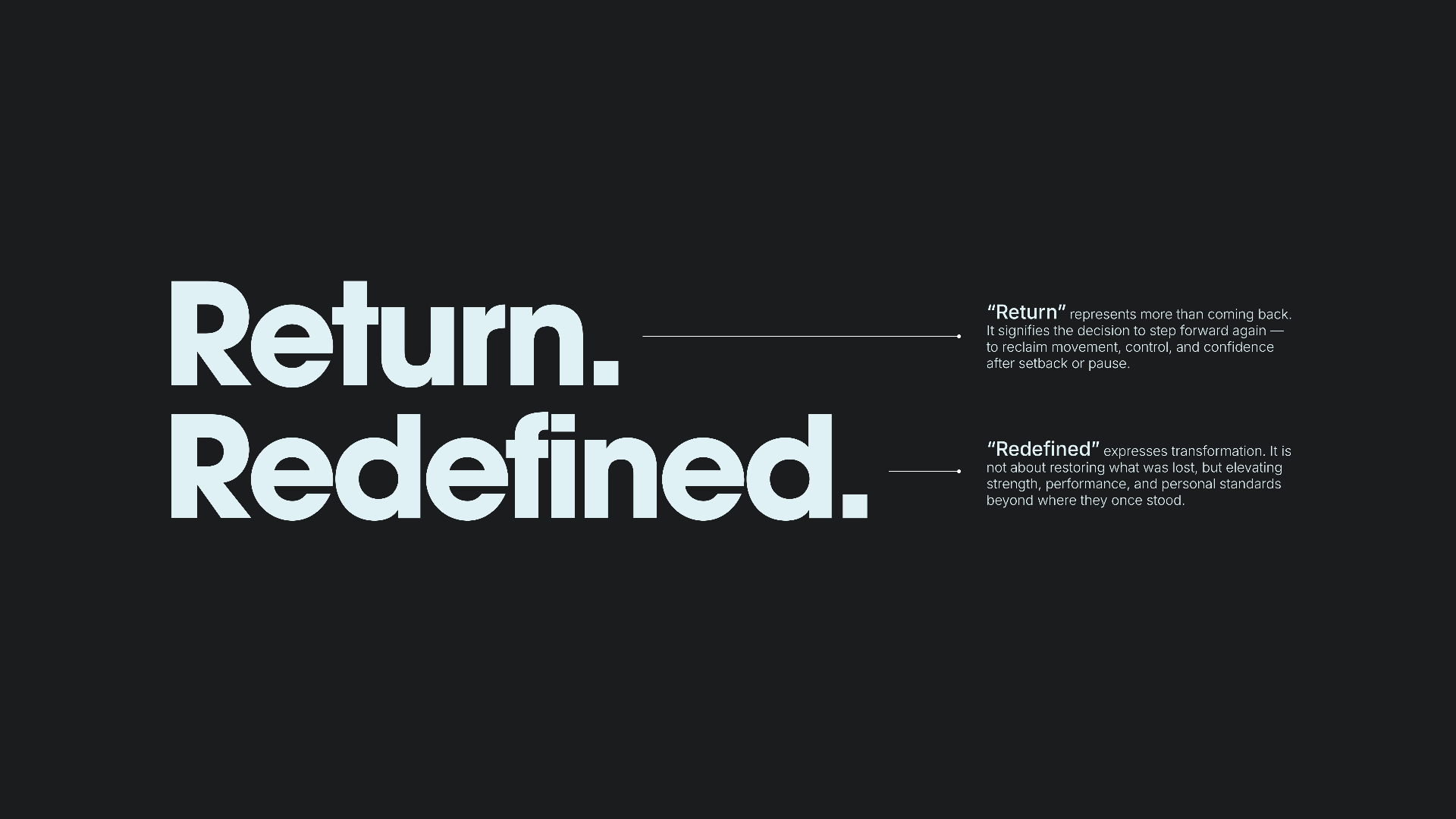
Two words. Maximum precision. The tagline was developed to resonate on two levels simultaneously: the physical act of returning to sport after injury, and the philosophical elevation of not just recovering, but transcending.
"Return."
Represents more than coming back. It signifies the decision to step forward again — to reclaim movement, control, and confidence after setback or pause.
"Redefined."
Expresses transformation. It is not about restoring what was lost, but elevating strength, performance, and personal standards beyond where they once stood.
Colour System
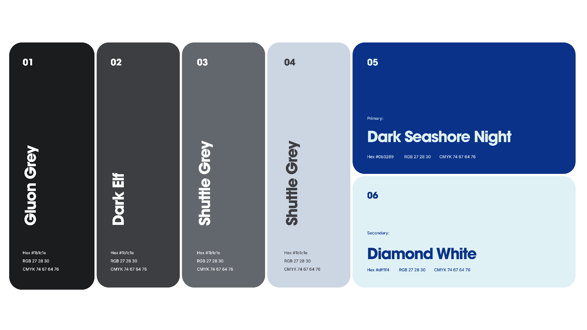
The palette is built around two primary brand colours — Dark Seashore Night (#0b3289), a deep confident navy, and Diamond White (#dff1f4), a crisp icy tone. Supporting neutrals extend the system across dark and light applications.
Colour Pairings
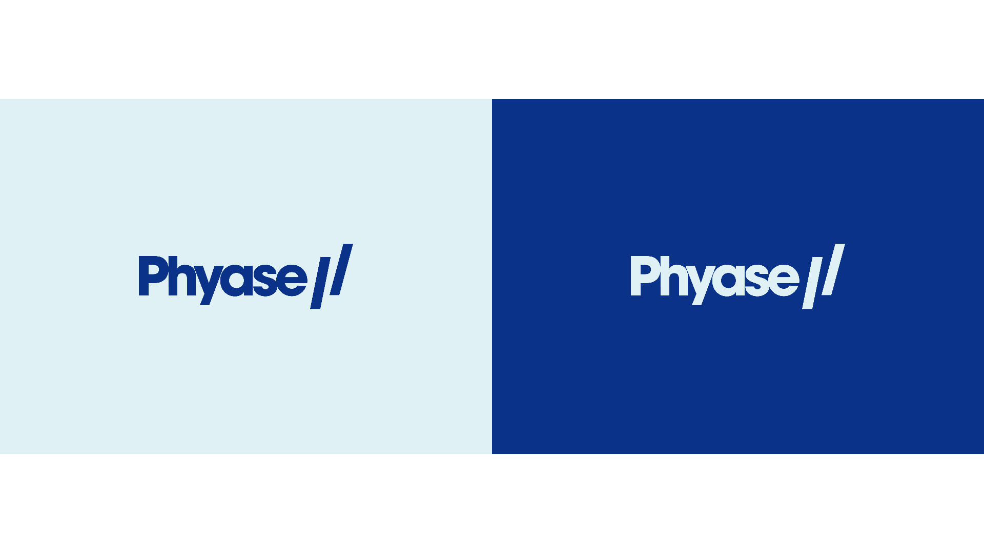
Each pairing was tested across application contexts — ensuring the logo reads with authority on every background.

Typography
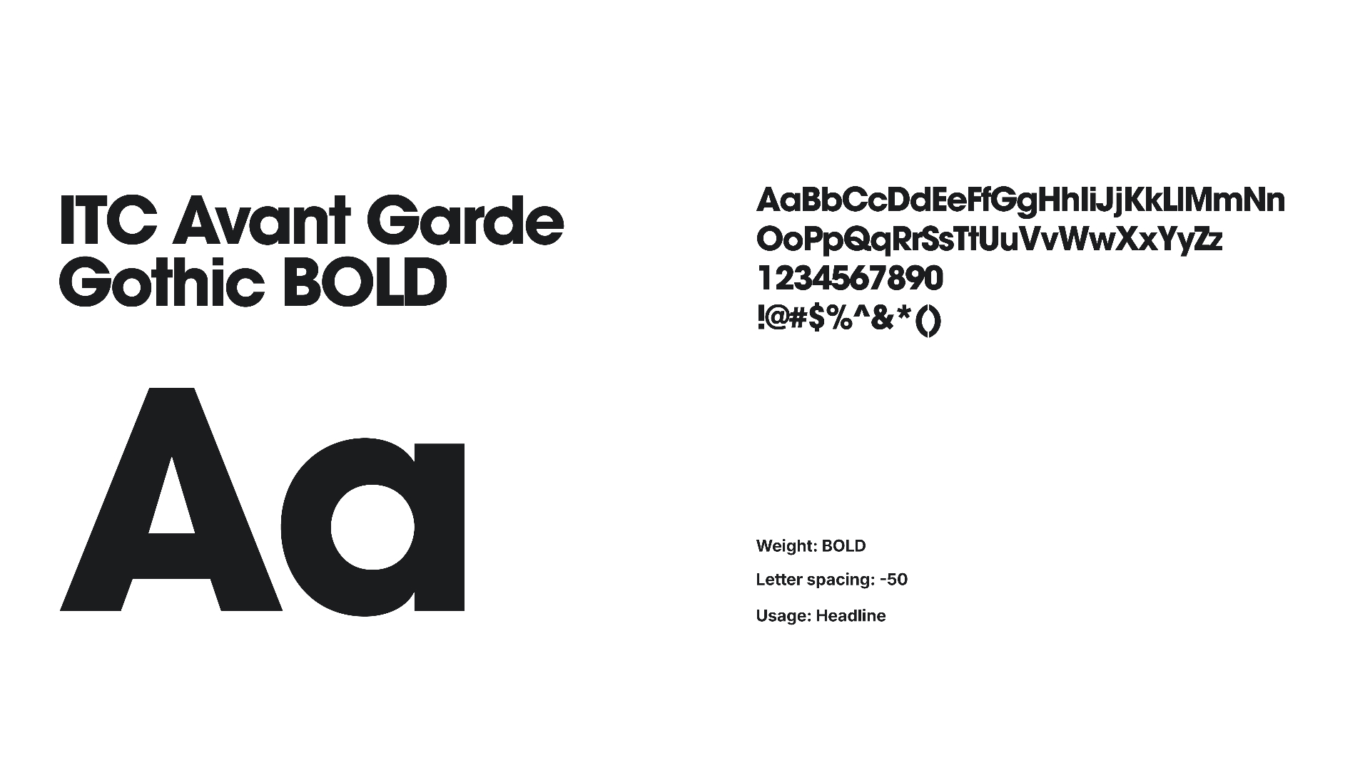
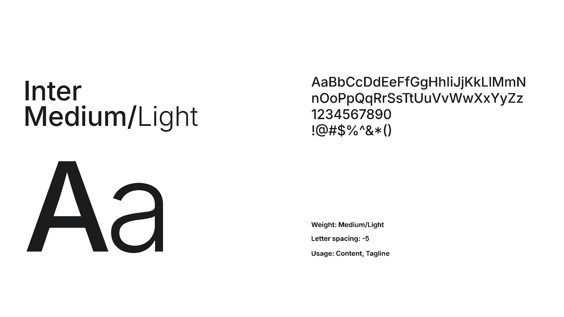
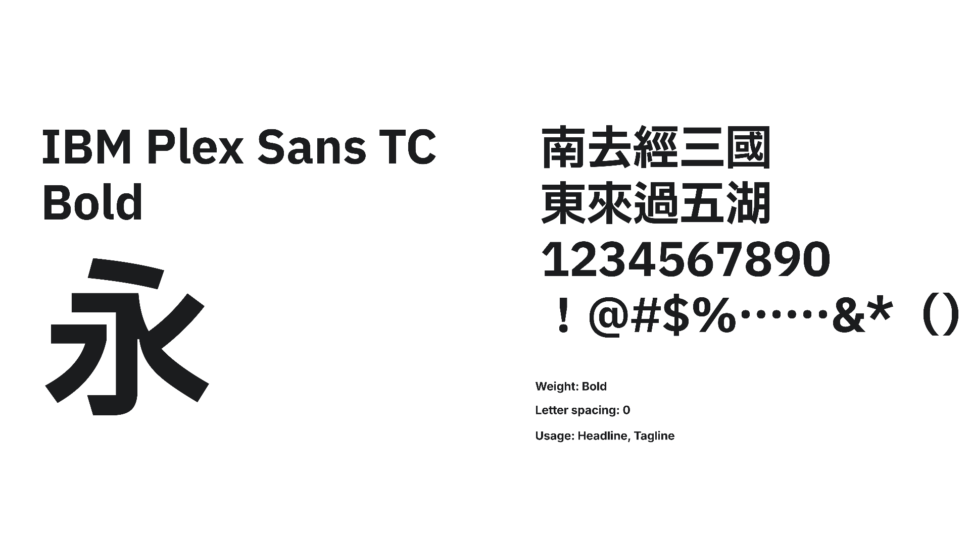
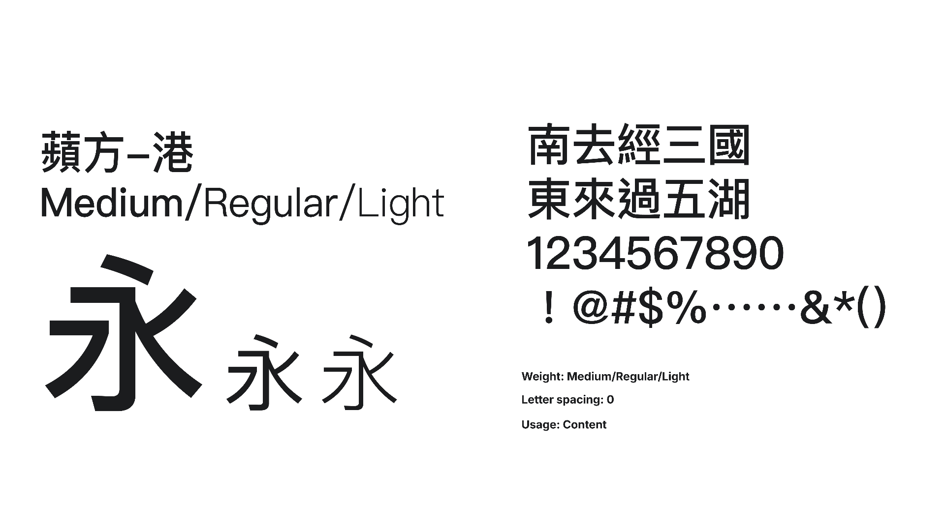
The type system pairs a bold geometric display face with clean functional body fonts, and extends bilingual support through dedicated Traditional Chinese typefaces. Every choice reinforces precision, confidence, and forward momentum.
Photography Direction
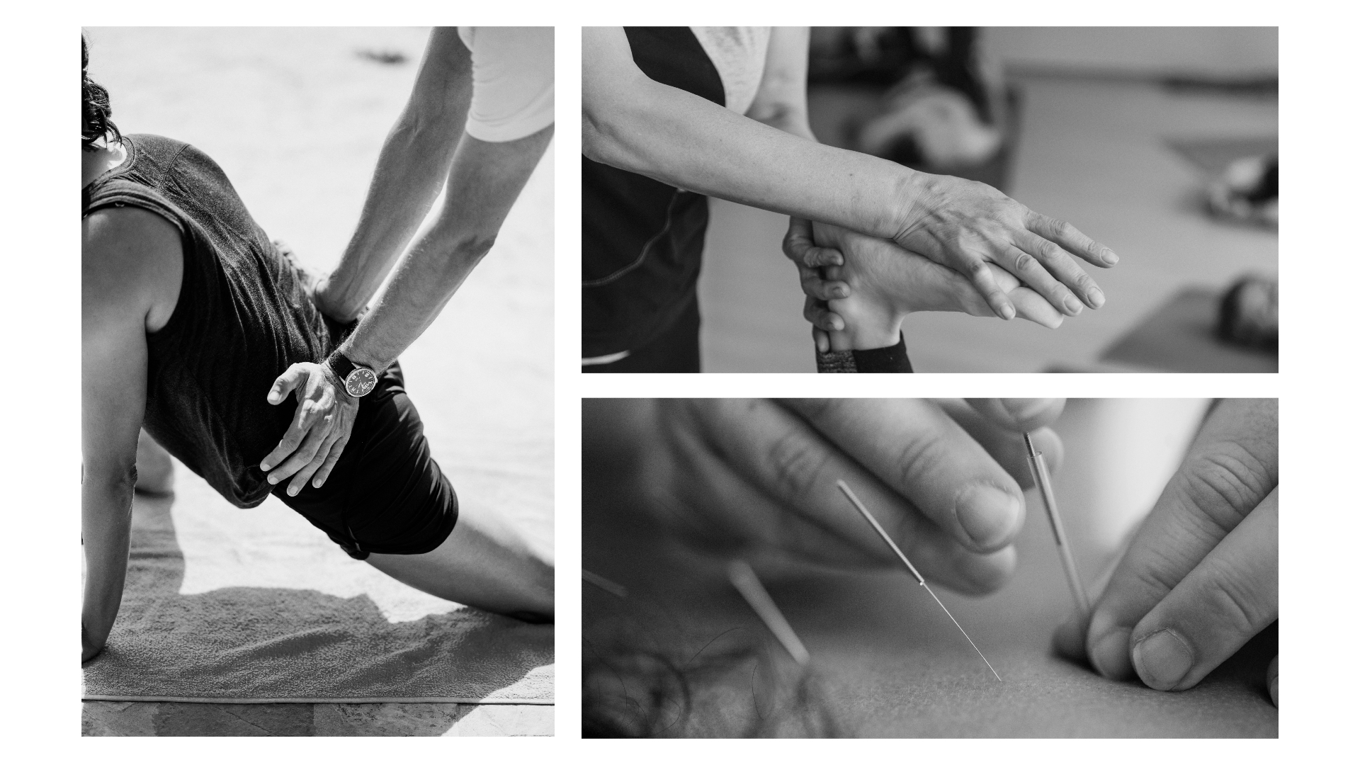
The photography system was built around a single directive: clean & minimal. Imagery is presented in black and white with strong contrast and defined shadows — stripping away colour to focus attention entirely on form, movement, and physical detail.
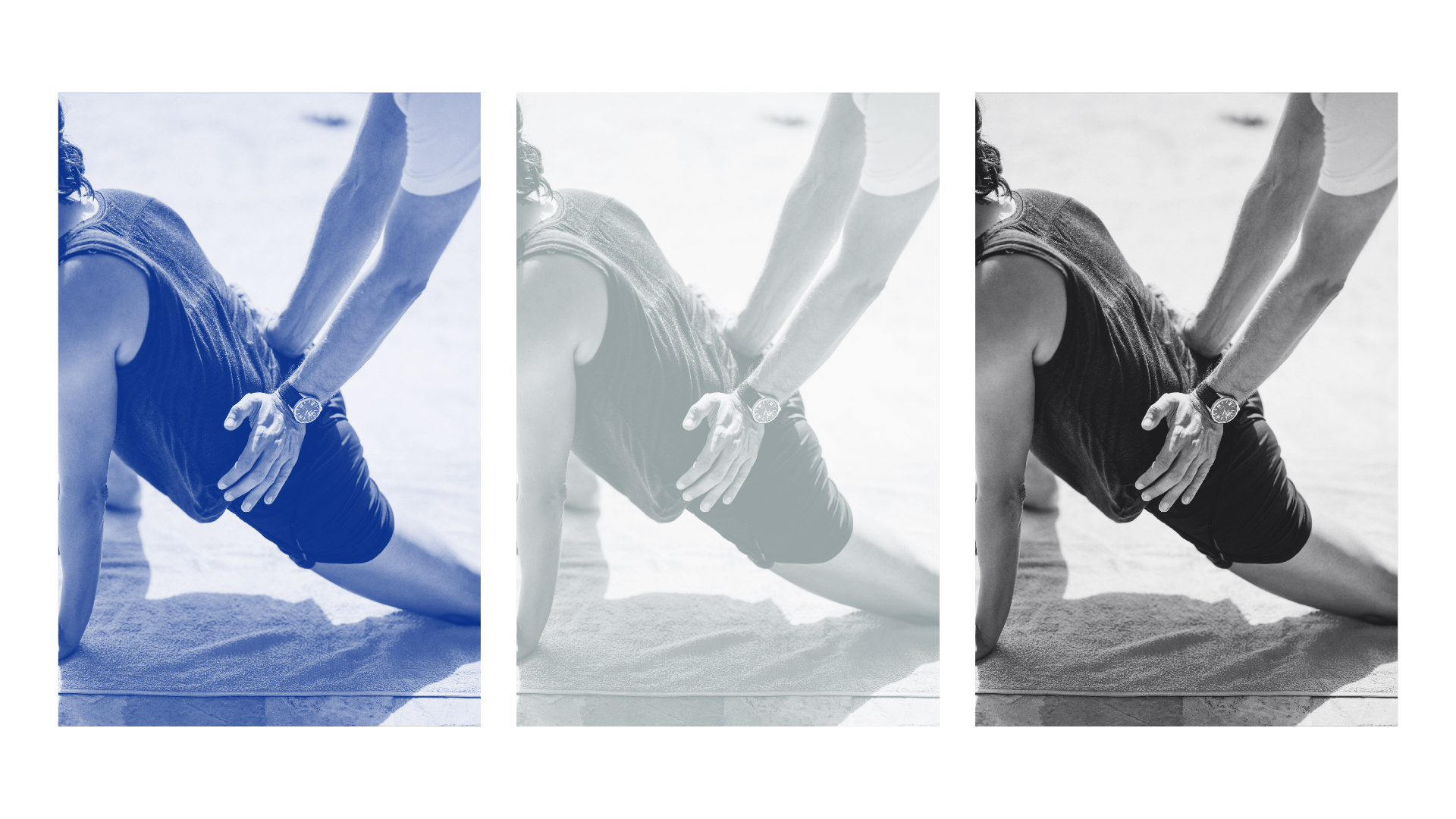
Light carves the body — highlighting muscle tension, joint alignment, posture, and motion. A colour overlay system using screen blend mode extends the palette into campaign imagery.
Reflection
Building PHYASE // from zero — naming, concept, tagline, logo, and system — was one of the most complete brand exercises I've undertaken. Every element had to earn its place: the name needed to carry clinical credibility and athletic energy simultaneously, the mark needed to feel instinctive yet symbolic, and the tagline needed to resonate across two languages and two emotional registers.
Working with a single founder means every decision was a direct conversation. There was no committee, no dilution — just a clear brief, strong conviction, and the discipline to distil a complex philosophy into its simplest, most powerful form.
The best brands don't describe what a company does — they communicate what it believes. PHYASE // is built on that principle.
Morework


WiiTH
Product Design
Social Media
With the identity system in place, I designed the brand's first social media content — demonstrating how the visual language translates into real-world posts across bilingual (English & Traditional Chinese) formats, dark and light treatments, editorial layouts, and photography-led compositions.