WUZO — Cross-Border Digital Banking Platform: A Product Design Case Study
Fintech Product · Digital Wallet · Multi-project · Shipped

Role
Product Designer (UI/UX)
Type
Fintech product · Digital wallet
Stage
Shipped
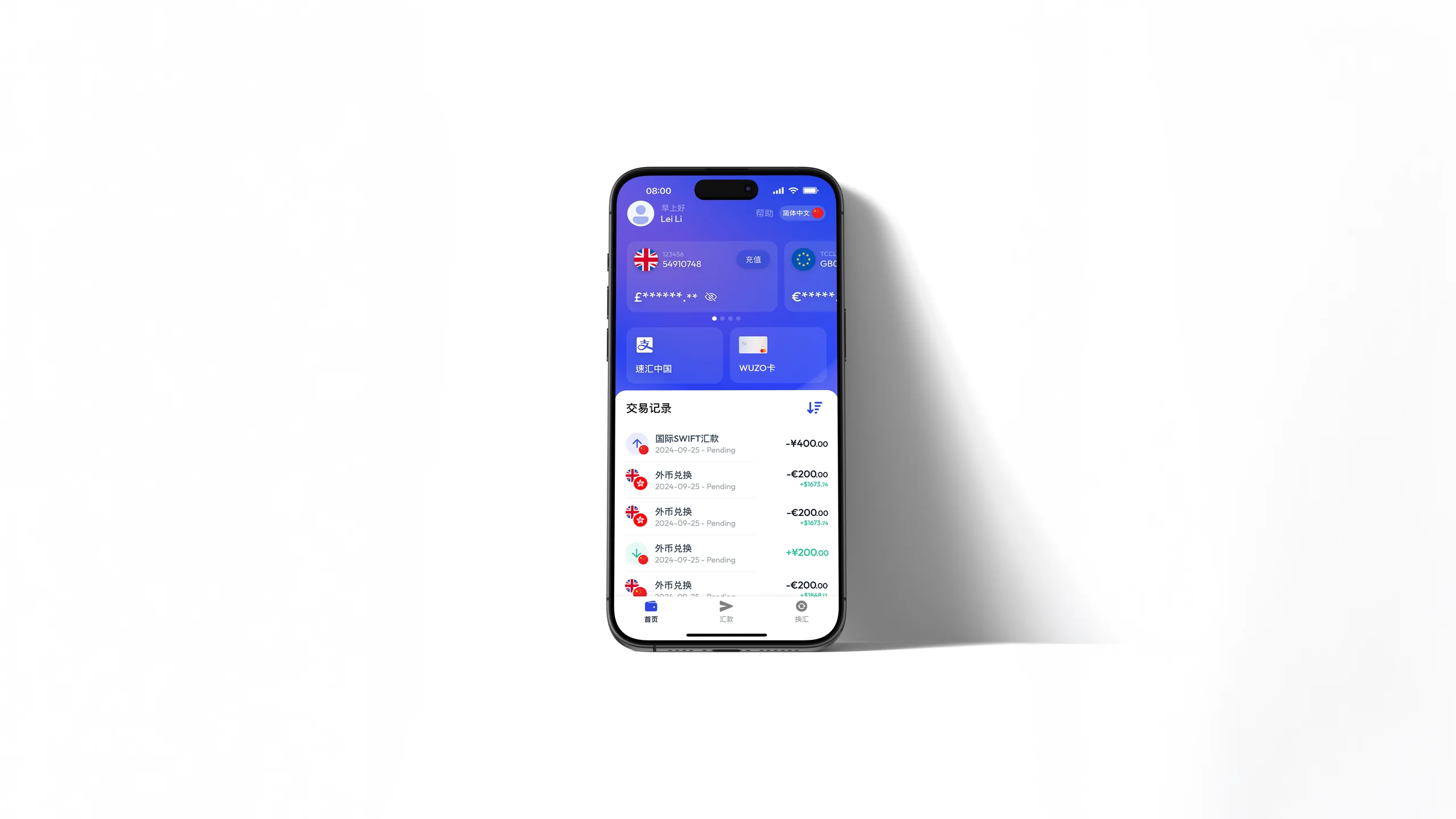
WUZO is a cross-border digital banking platform serving UK and EU residents, with a strong focus on culturally aligned financial experiences for the Chinese diaspora community.
Over multiple initiatives spanning 12+ months, I helped evolve WUZO from a functional remittance tool into a behaviour-driven fintech product.
My role
Product Designer (UI/UX)
- Research & concept development
- Interaction & flow design
- Design system & UI delivery
- Navigation & architecture strategy
Collaborators
- CTO
- Business Operations
- Engineering Team
Structural UX optimisation · 3 months
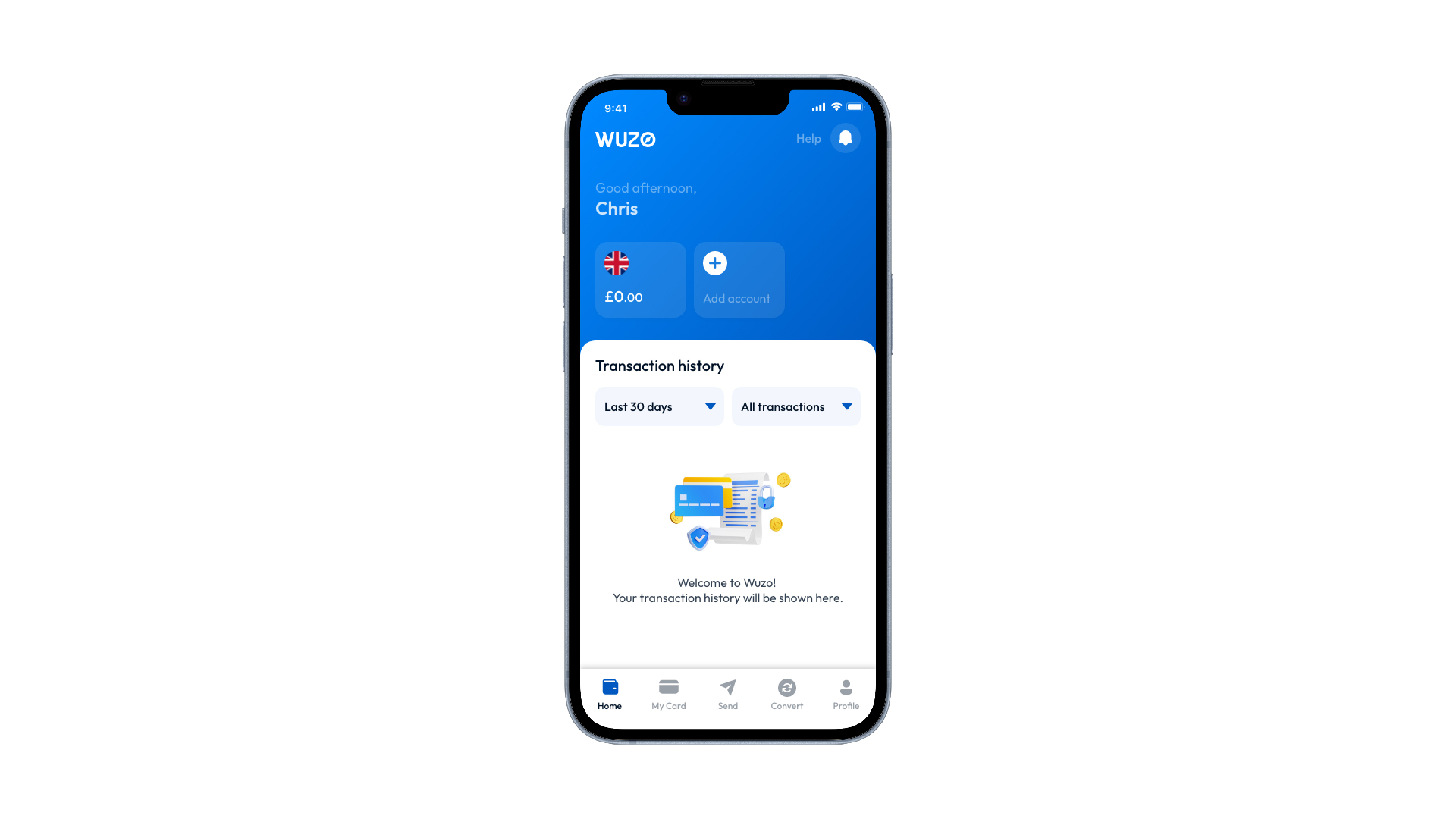
The home screen had grown feature-by-feature, losing structural clarity. This project restructured it around real user behaviour.
- Action clarity
- Feature prioritization
- Privacy control
- Cognitive load
Problem
The home screen had become useful, but not yet legible. Important actions were present; they were simply competing for the same attention.
Too many taps
A daily action felt like a mini journey.
Friction
High-frequency actions sat behind unnecessary navigation.
Wrong hierarchy
The app was organised by features, not intent.
Friction
Navigation reflected product structure, not daily behaviour.
Privacy exposed
Opening the app could reveal financial information instantly.
Friction
Balances appeared by default, including in public settings.
Density over clarity
Useful information competed with primary actions.
Friction
The screen showed plenty, but did not guide the next action.
Research
Customer interviews, recurring product feedback, and behavioural patterns pointed to the same repeated goals. People were not asking for a denser home screen. They were trying to complete a small set of financial checks with less hesitation.
Check balances
"I just want to know if I've been paid."
Insight
Immediate confidence matters more than detailed account information.
Send money
"I open it when I need to move money quickly."
Insight
The fastest action should sit closest to the surface.
Convert currency
"I check the rate before I decide what to do."
Insight
Conversion is a decision moment, not a secondary utility.
Top up funds
"I need to know I'm ready before I spend."
Insight
Preparedness is part of the payment experience.
Research didn't reveal more features to build. It revealed what to remove.
Design decisions
01
One-tap account access
Before
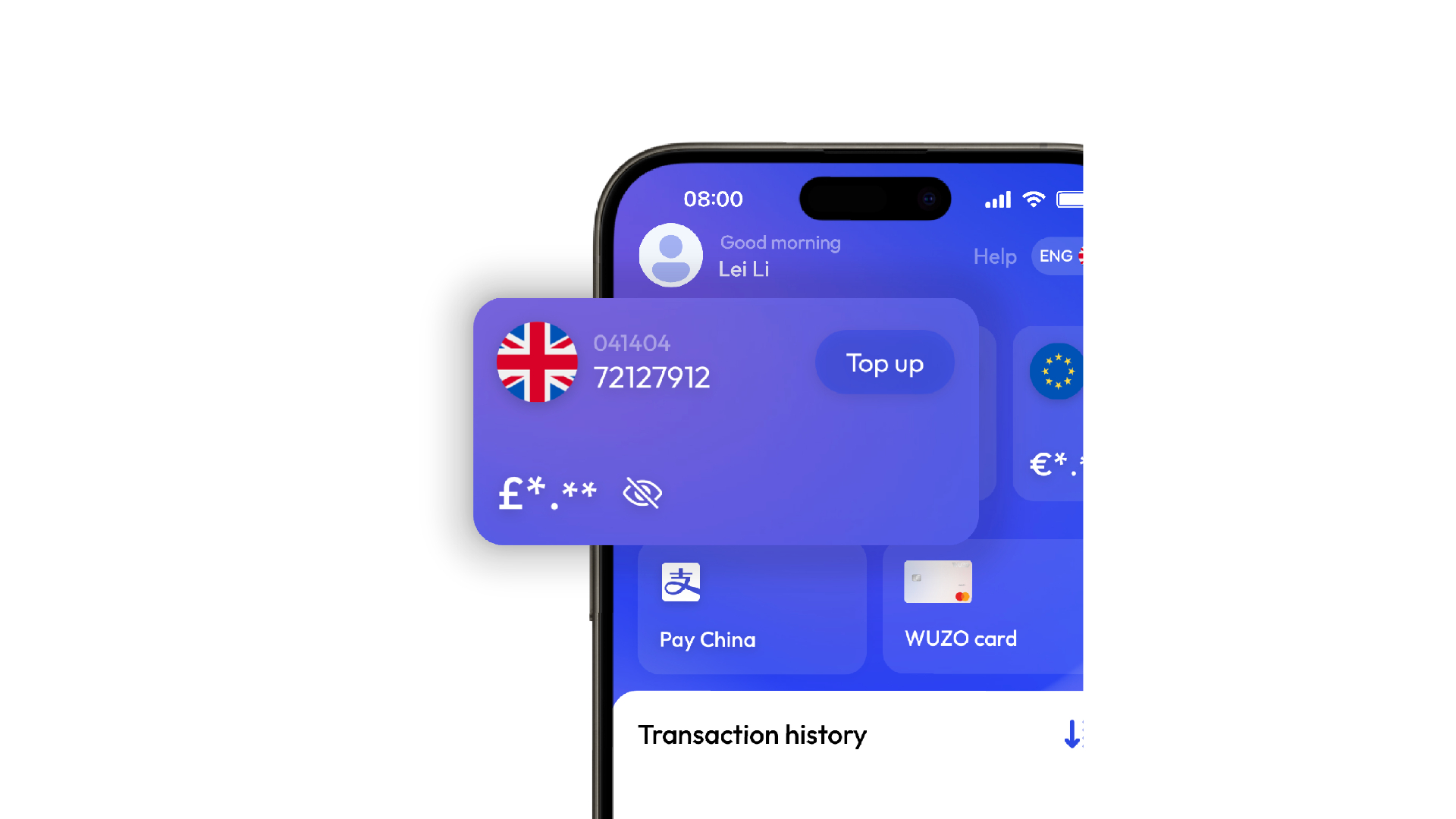
Accessing account details required 3 steps: Home to Account to Local to Account Details. Too much friction for a daily task.
After
Account details are listed directly on the home screen currency tab: one tap, in context, no extra navigation.
02
Navigation restructure
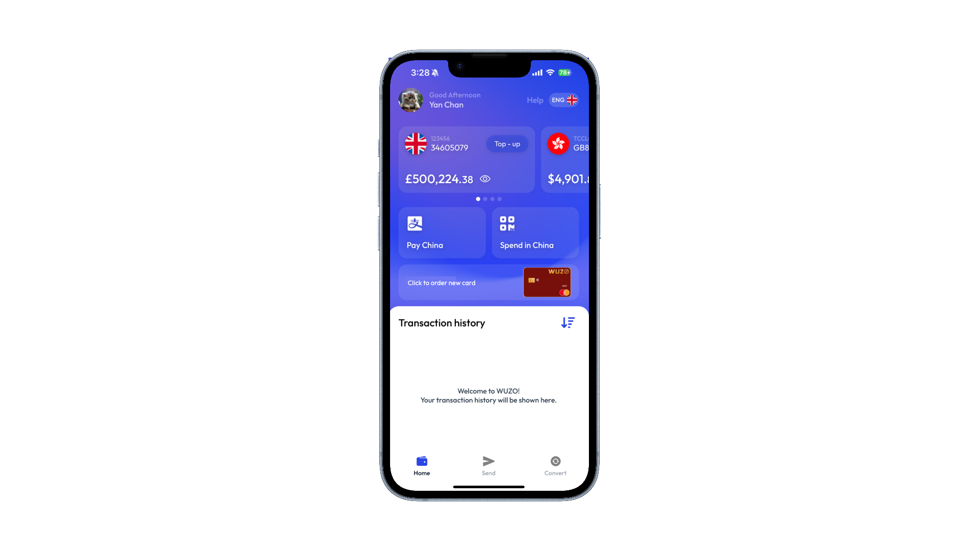
Send, Convert, and Home drive 80%+ of daily sessions. Reduced bottom nav to these three. Secondary features moved out of the main path.
03
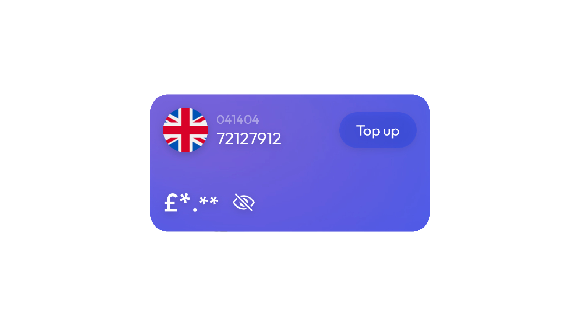
Privacy by default
Problem
Balances visible on launch.
Risk
Exposure in public spaces.
Solution
Hidden by default, tap to reveal.
Impact
Network effect
More users -> more value
Viral loop
Payments invite new users
Habit formation
Daily transactions build retention
Acquisition engine
Each send = conversion opportunity
"The most meaningful improvements were not visual.They were hierarchical."
Morework



Mou
Brand Identity